
TOTS
Mobile Product Resedign
AI-Driven Parenting App Proposal
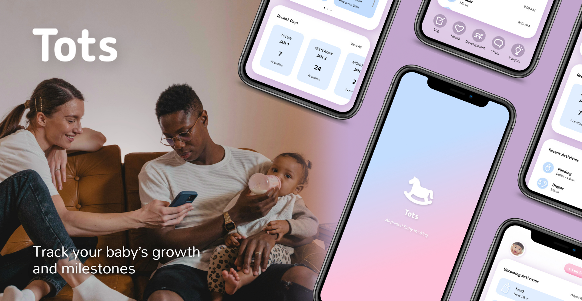
Tots is an AI-powered assistant designed to help parents track milestones and daily care. I created a redesign proposal to transform the interface into a seamless, high-trust experience, for clarity, cohesion, and effortless navigation. By bridging the gap between sophisticated AI logic and a warm, approachable aesthetic, I created a version of the tool that feels less like a data entry app and more like a supportive partner.
ROLE
Art Director, Designer.
DELIVERABLES
Wireframes, Brand identity, Product design.
TOOLS
Figma.
Strategy Overview
Problem
Tots needed a mobile redesign to transform a complex parenting tracker into a simple, intuitive digital companion that reduces cognitive load for busy, sleep-deprived parents.
Opportunity
Simplify dense clinical data into a calm, user-friendly interface, balancing medical reliability with a warm, approachable design.
Audience
Tech-savvy new parents seeking a reliable, easy-to-use tool that helps them track and understand their child’s development without adding stress.
Concept design
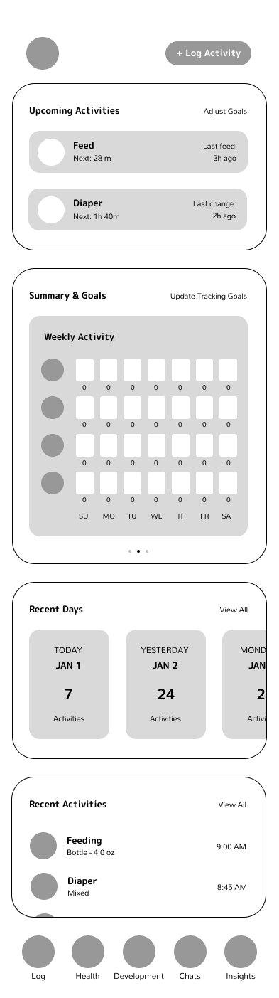
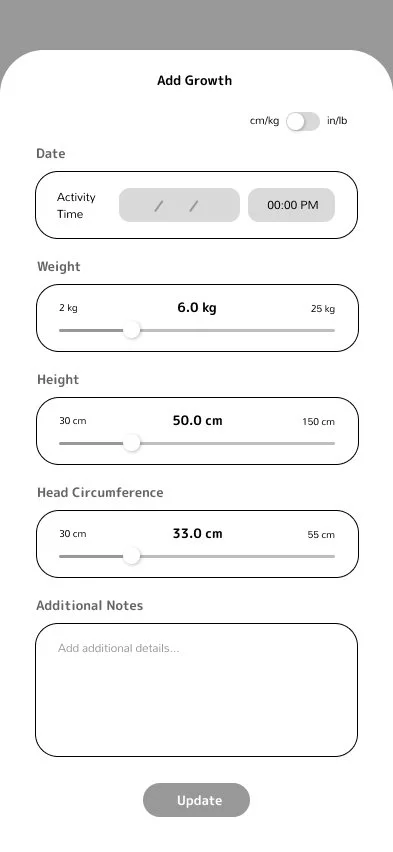
This concept merges medical precision with nursery warmth, using a "playful-clinical" aesthetic to provide instant clarity for parents. By replacing dense text with structured grids and soft illustrations, it transforms complex data into a calming, intuitive companion. The result is a streamlined, intentional interface that prioritizes effortless navigation over cognitive load
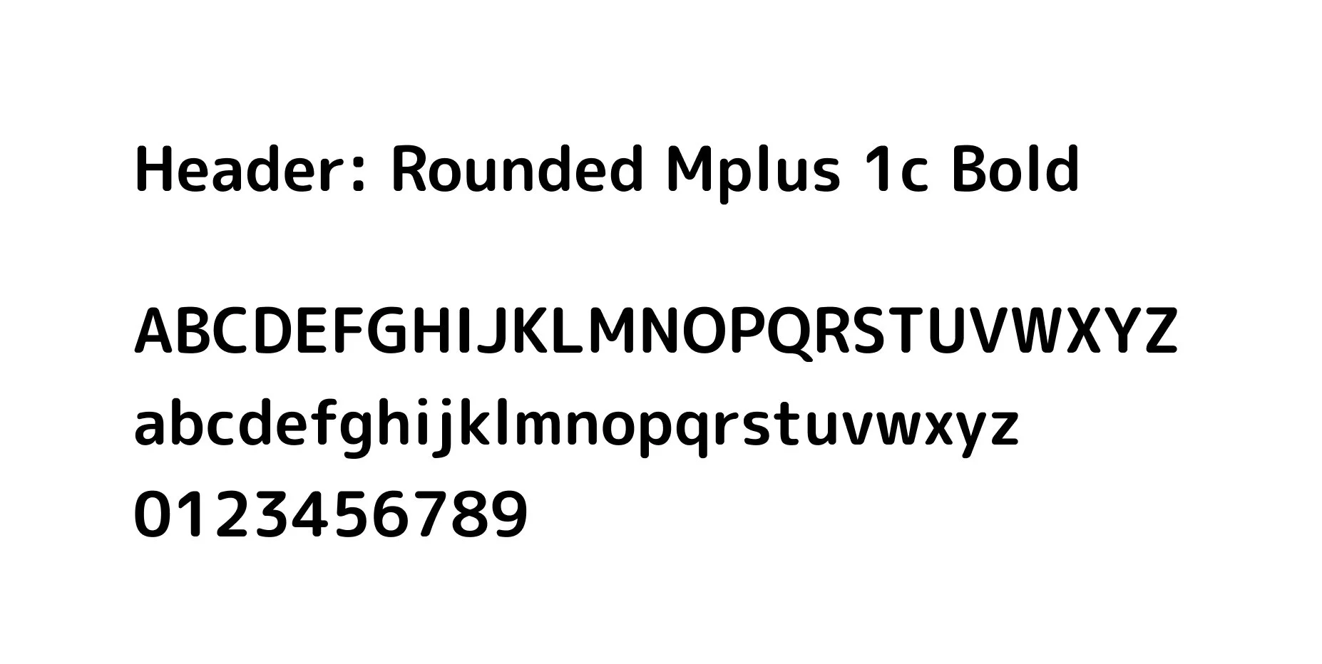
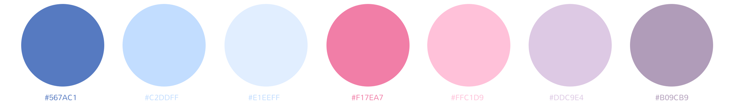
Design Elements
LOGO
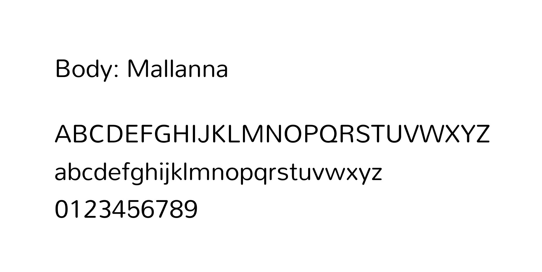
FONTS
COLOR PALETTE
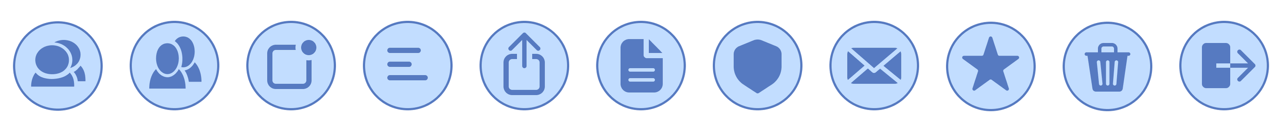
ICONS
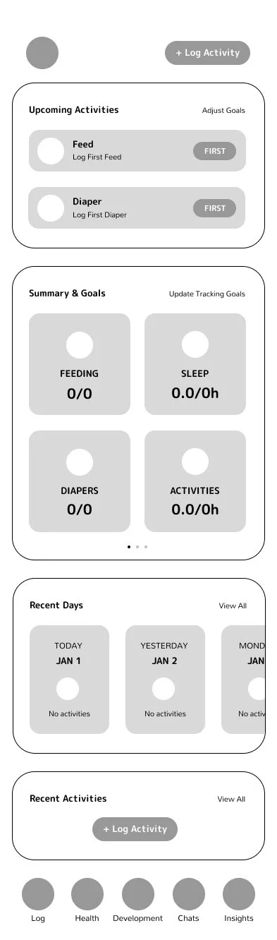
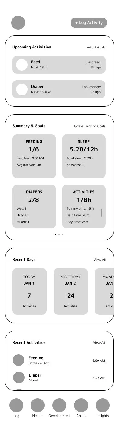
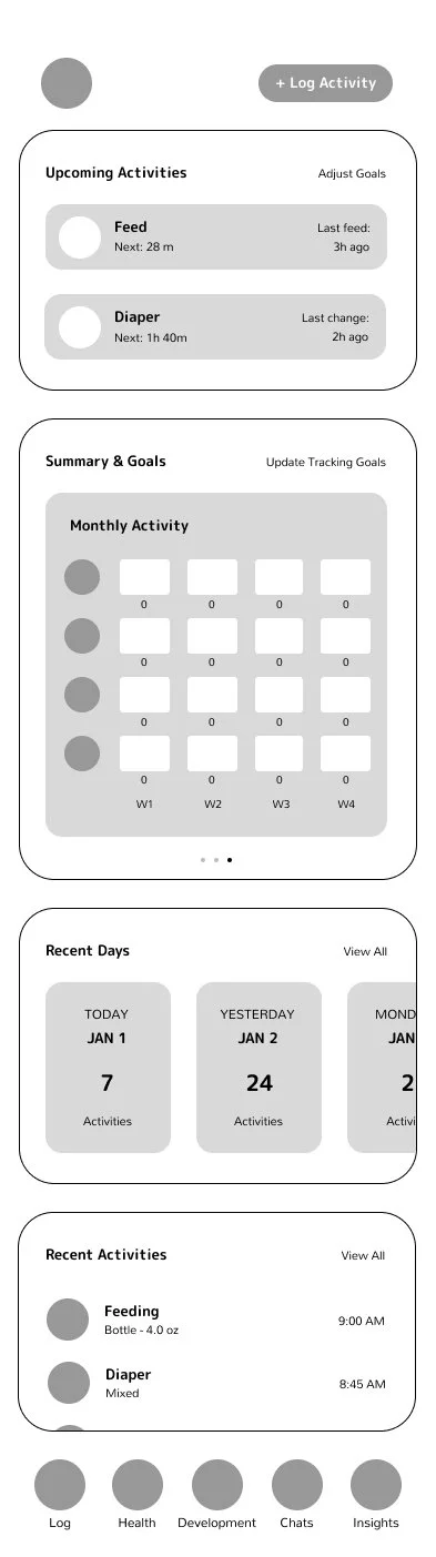
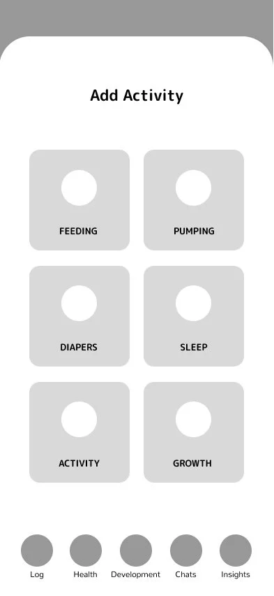
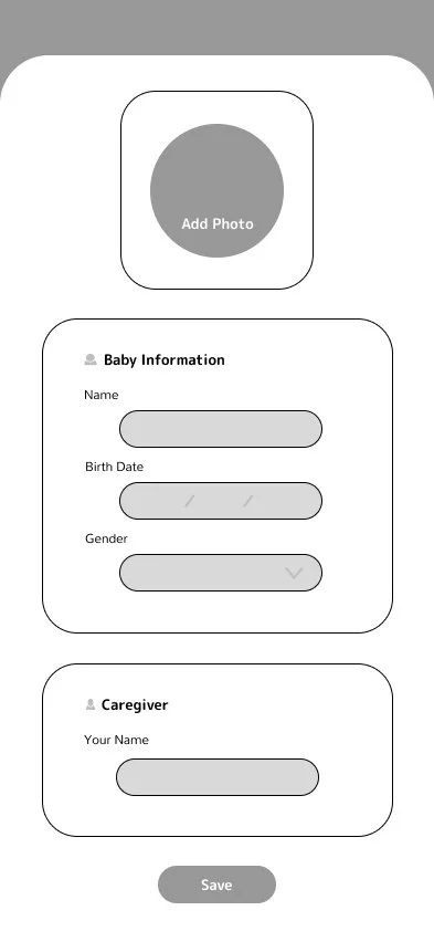
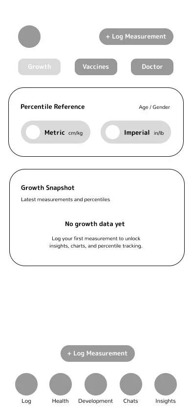
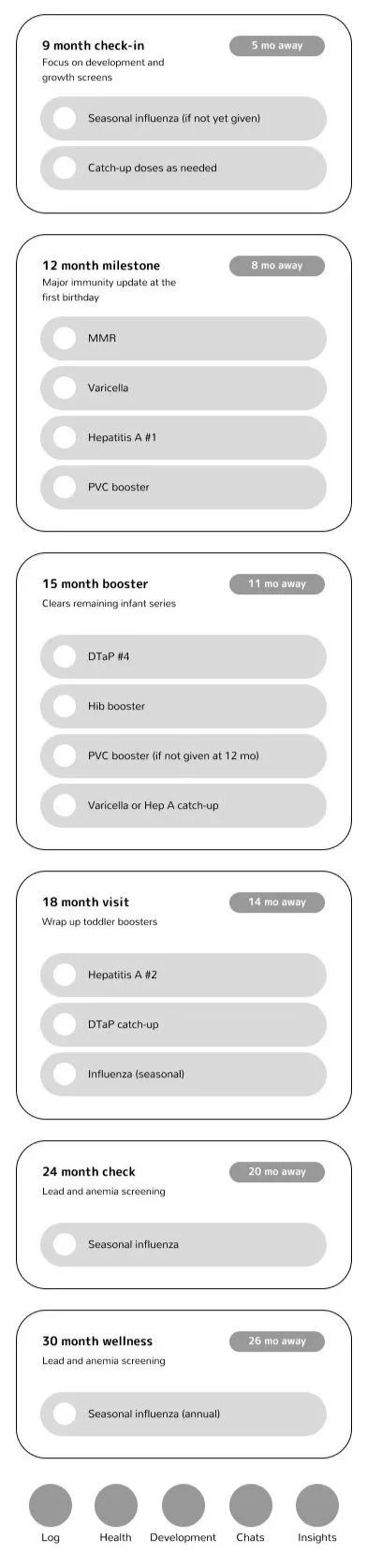
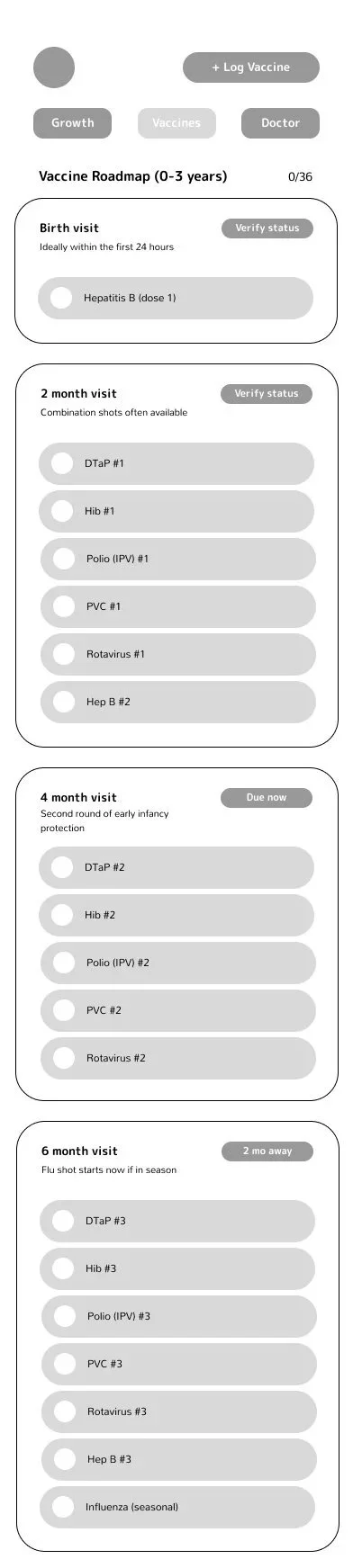
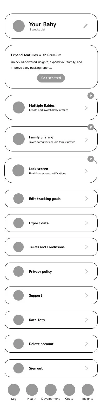
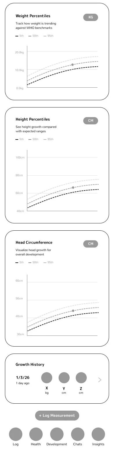
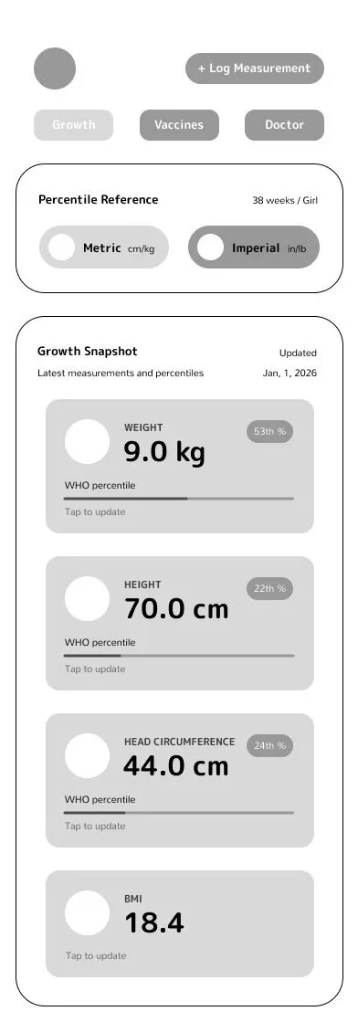
Wireframes

Product Launch & Lessons
Tots embodies that clarity is a form of empathy. The transition from a fragmented tool to a cohesive, AI-guided assistant proved that "one-handed" usability is a functional requirement, not just a design goal. I learned that by balancing a clinical grid with soft, playful art direction, we could build deep user trust without sacrificing the speed and precision required for medical tracking.
KEY RESULTS:
Enhanced Efficiency: Reduced the time and taps required for primary tracking tasks.
Developed and implemented a scalable design system across all screens, ensuring brand consistency.